Drive
Built inFramer
A dark, modern website for an AI marketing product, built to explain what the product does and move visitors to try it.
01 The brief
Show the product before explaining it
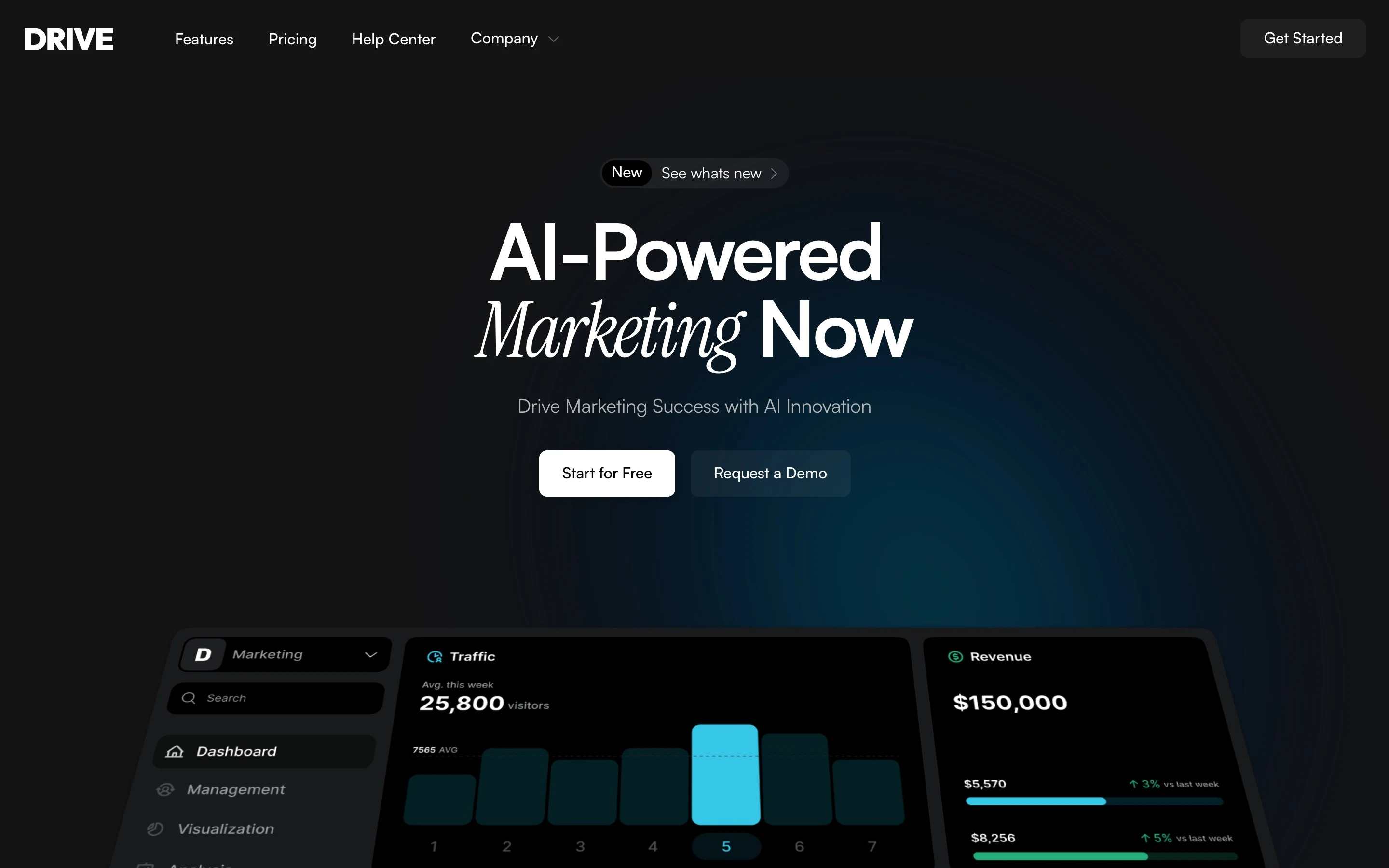
AI products are hard to picture. Drive shows the product before it explains it: one headline, a pair of clear buttons and a dashboard preview right under them.
02 My role
Design, structure and build
Design and development happened together, straight in Framer, with no separate design file. I planned ten page types and built the whole site there, with CMS collections for the changelog and the blog.
03 Decision
A near-black page with one bright accent
White type and a single cyan accent keep attention on the product. One italic serif word in each headline adds a human note to a technical subject.
The trade-off: dark pages need careful contrast, so every grey was checked against the background.
04 Decision
From promise to proof
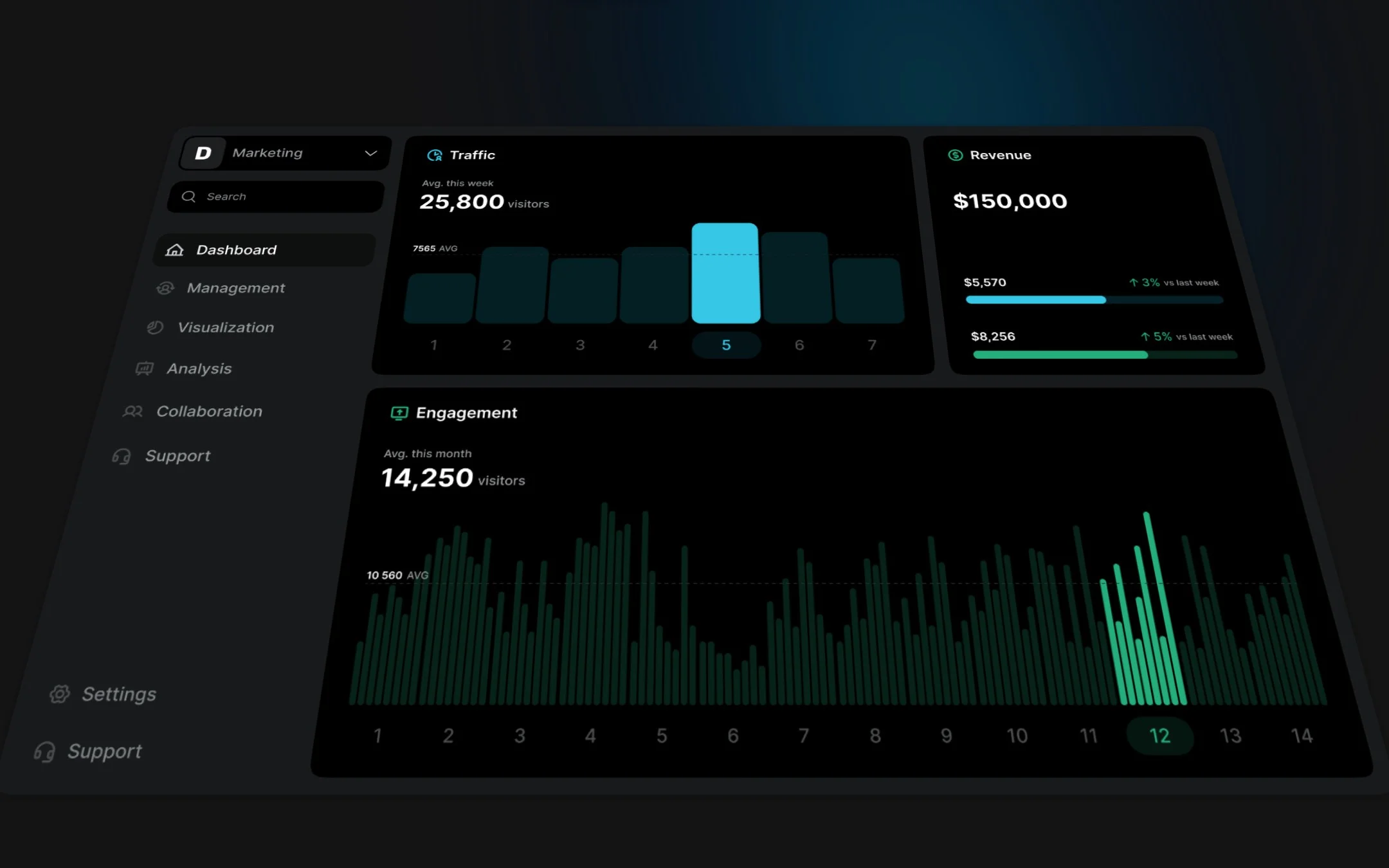
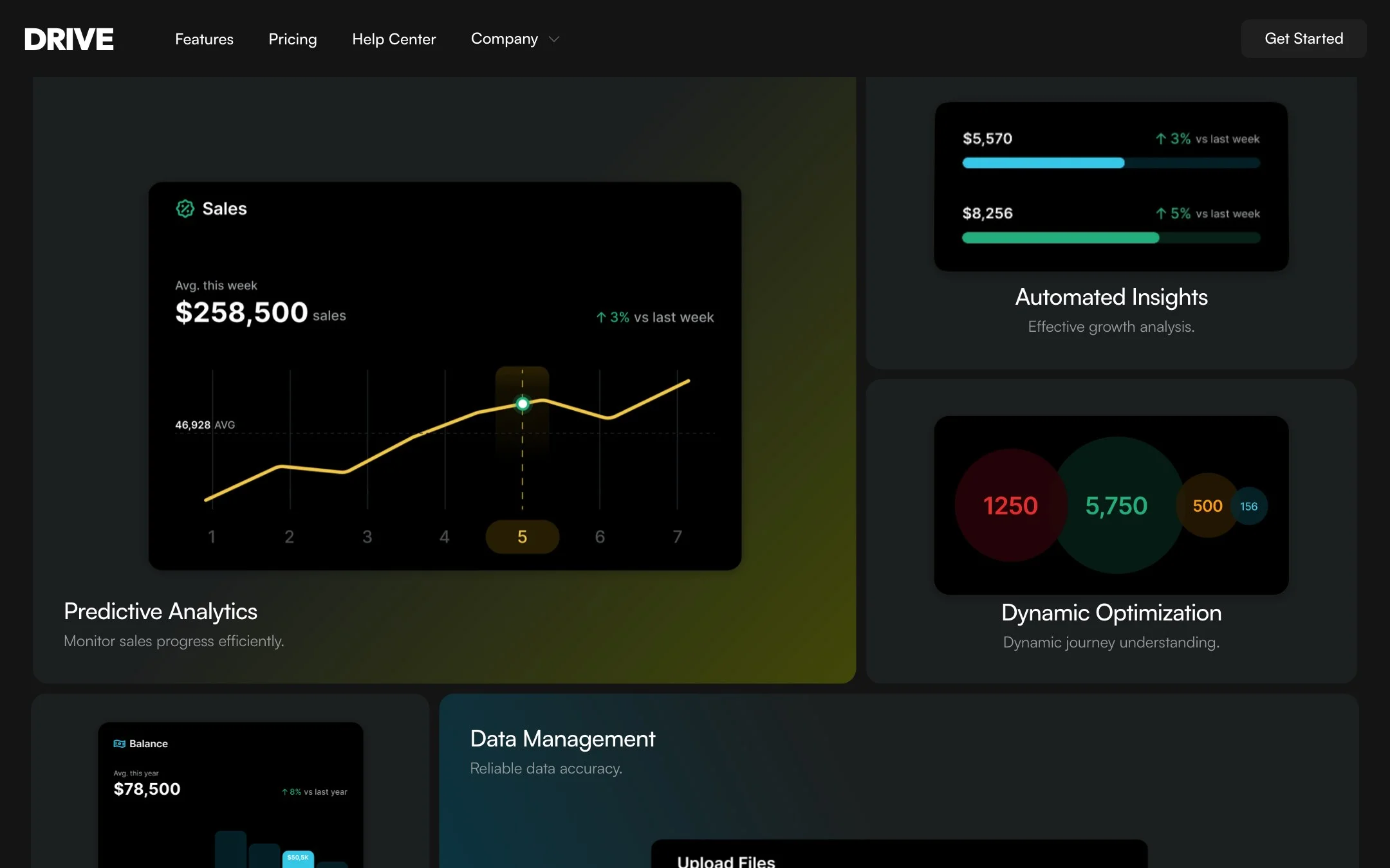
The page moves from headline and dashboard, through a bento grid of features, to customer quotes and a short FAQ. Each feature card carries one small interface preview, so it is understood at a glance.
05 Build
Built in Framer
The changelog and the blog are CMS collections: releases and posts are added without touching the design. Pricing, Features, Careers and Help Center are ready as separate pages.

06 Result
A complete product site
A full website, ready to fill with your own content.
Hiring a designer? Download my résumé
More projects