Linie
Built inFramer
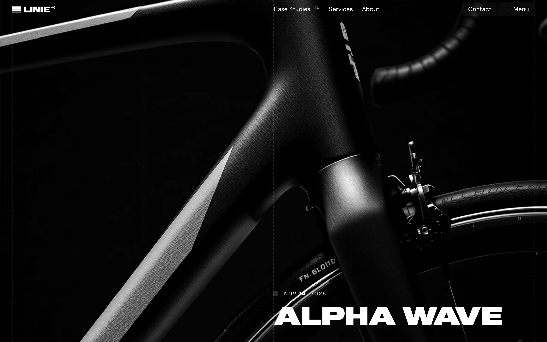
A bold, editorial website for a design studio: oversized type, a strict grid and photography that does most of the talking.
01 The brief
A studio site with opinions
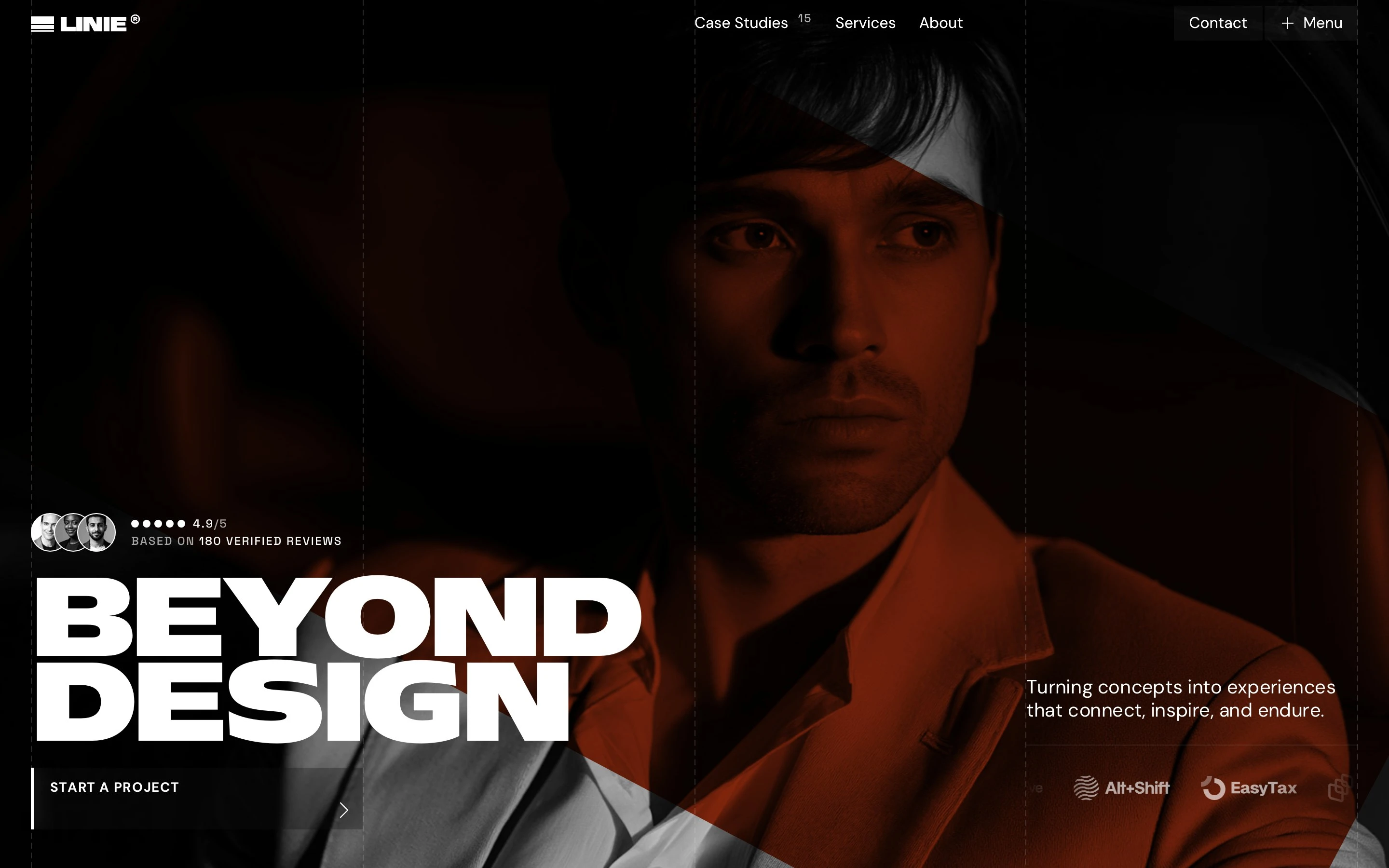
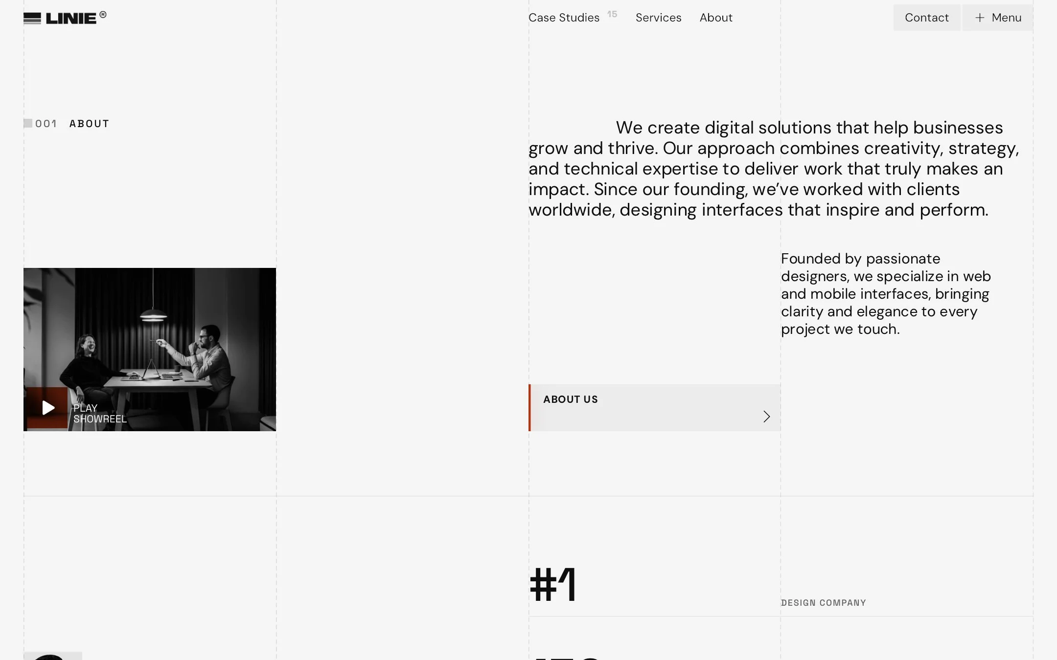
Most studio sites look alike. Linie is built to look like a studio with opinions: big type first, a calm grid, and a single clear action on the first screen.
02 My role
Design, structure and build
I did it all on my own. I started with the design in Figma, then moved it into Framer and built the site there. Nine page types, from Home and Services to Journal and Careers, plus CMS templates for case studies and articles.
03 Decision
Type carries the personality
Heavy, oversized headlines do the talking, so everything around them stays quiet: thin dashed grid lines, dark and light sections taking turns, one red accent.
The trade-off: a look this bold needs strong photography, so the template ships with a clear photo style to follow.
04 Decision
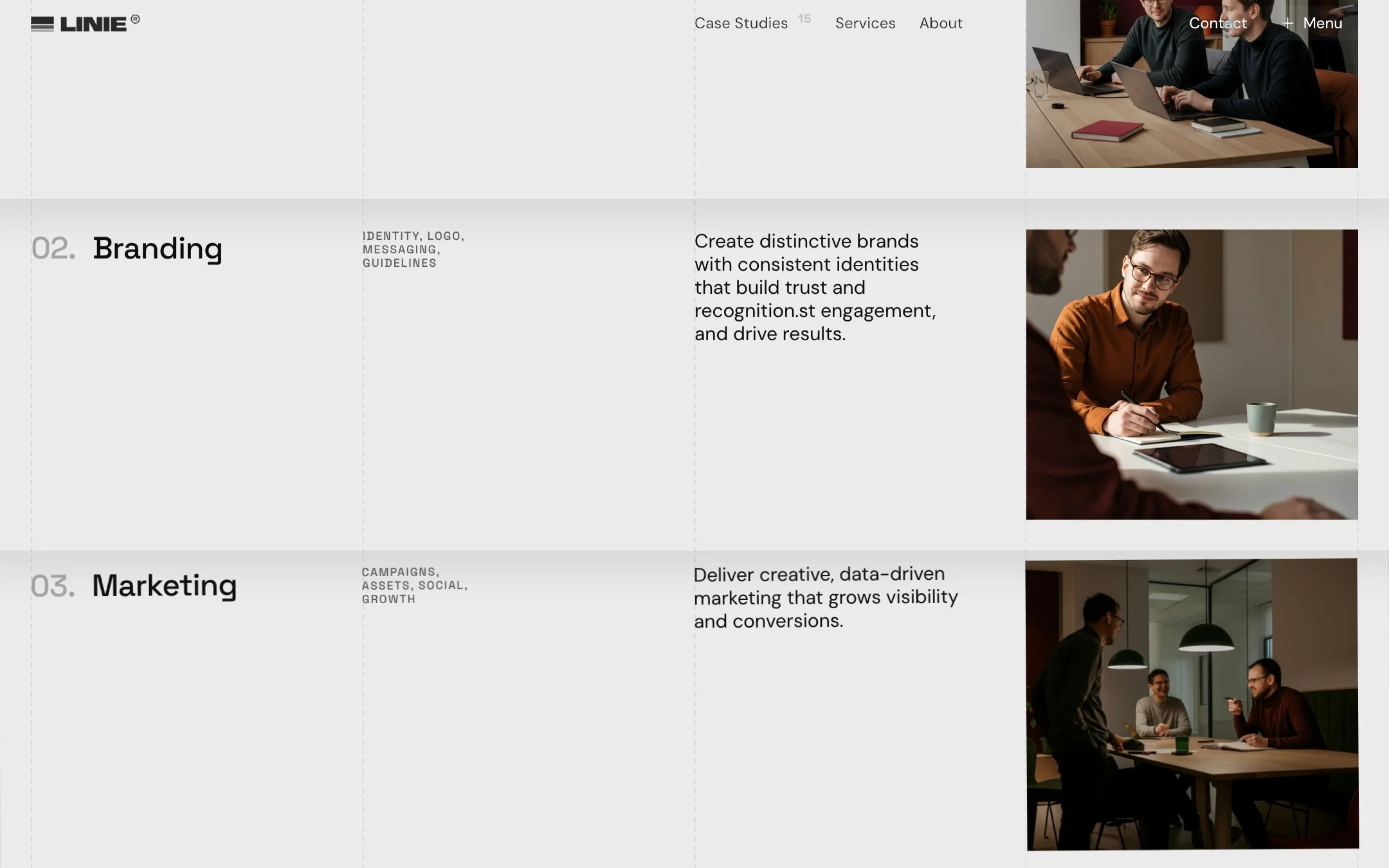
Services as numbered rows
Design, Branding, Marketing and Code are four rows with one line and one photo each. The page reads in seconds, and nobody has to open a card to learn what the studio does.
05 Build
Built in Framer
Case studies and journal articles are CMS collections, so adding a new one is quick and needs no layout work.
06 Result
A complete studio site
A complete site, ready for your content.
Buyer feedback
What buyers said
“I really enjoy how flexible and well-structured the template is. It made customization smooth and intuitive, and with your help, it truly started to feel like my own. I also appreciate the clean design and attention to detail it saved me a lot of time and elevated the overall quality of my project.”
Hiring a designer? Download my résumé
More projects